I wanted to upgrade my voltmeter clock with illuminated voltmeters that react to the ambient level of brightness. So I had to design a new case for the voltmeter mechanics and electrics that included light guides or rather diffusers. This posed and interesting challenge and learning curve that I detail in the following. Now, I have yet to finish my research with this and I will post again when I evaluated new designs.
Hypothesis of operation
My first thought was to put as much plastic between the source of light and the screen as feasible. On the other hand, too much attenuation can lead to heavier falloff. I figured that the inverse square law where the intensity is inversely proportional to the square of the distance from the source (meaning that a point twice as far away receives only one quarter the light) would apply in plastic just as much as it does in air.
So with that, I decided to try both approaches.
Designs
In the following, I present my designs. The images of the outcome were taken indoors, both with the room light on and off. The settings for the camera were as follows:
| Camera maker | Sony |
| Camera model | ILCE-7M3 |
| ISO speed | ISO-1000 |
| F-stop | f/4.5 |
| Exposure time | 1/100 sec. |
| Exposure bias | 0 step |
| Exposure program | Shutter priority |
| Metering mode | Pattern |
| Flash mode | No flash, compulsory |
| Focal length | 50 mm |
| Lens maker | Sony |
| Lens model | SEL2870 |
V6
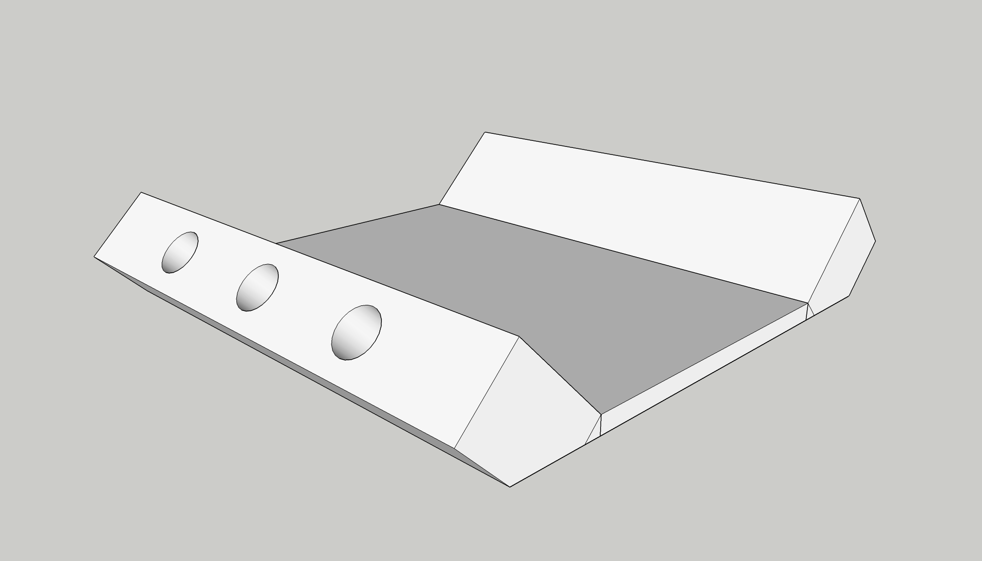
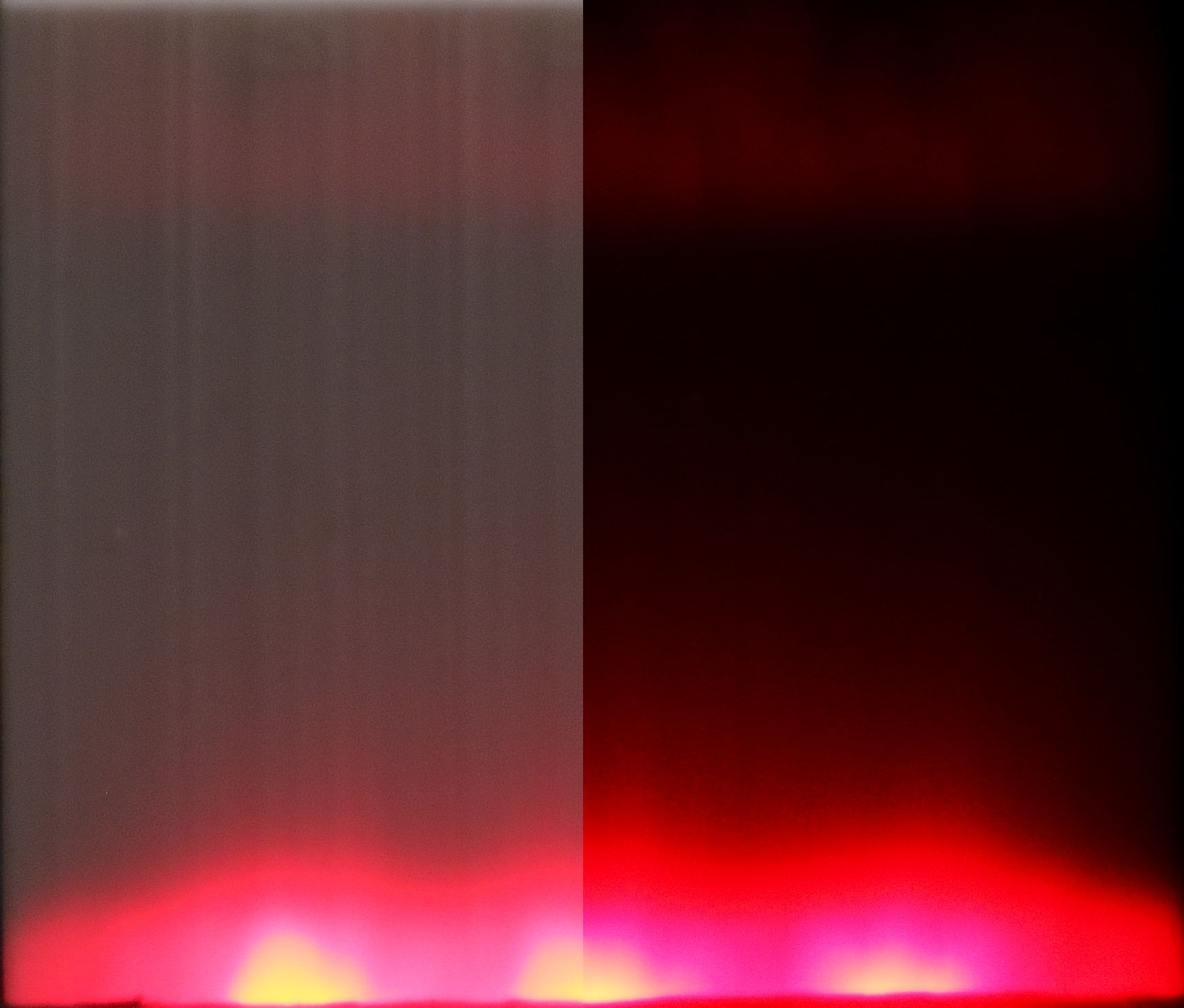
Reminiscent of a V-engine, this design aims to diffuse through both pointing the light source not directly at the screen as well as using generous amounts of plastic.
 |
 |
|---|
Rating: Very bad, because of the strong attenuation the falloff is severe.
Single-edge sidelight
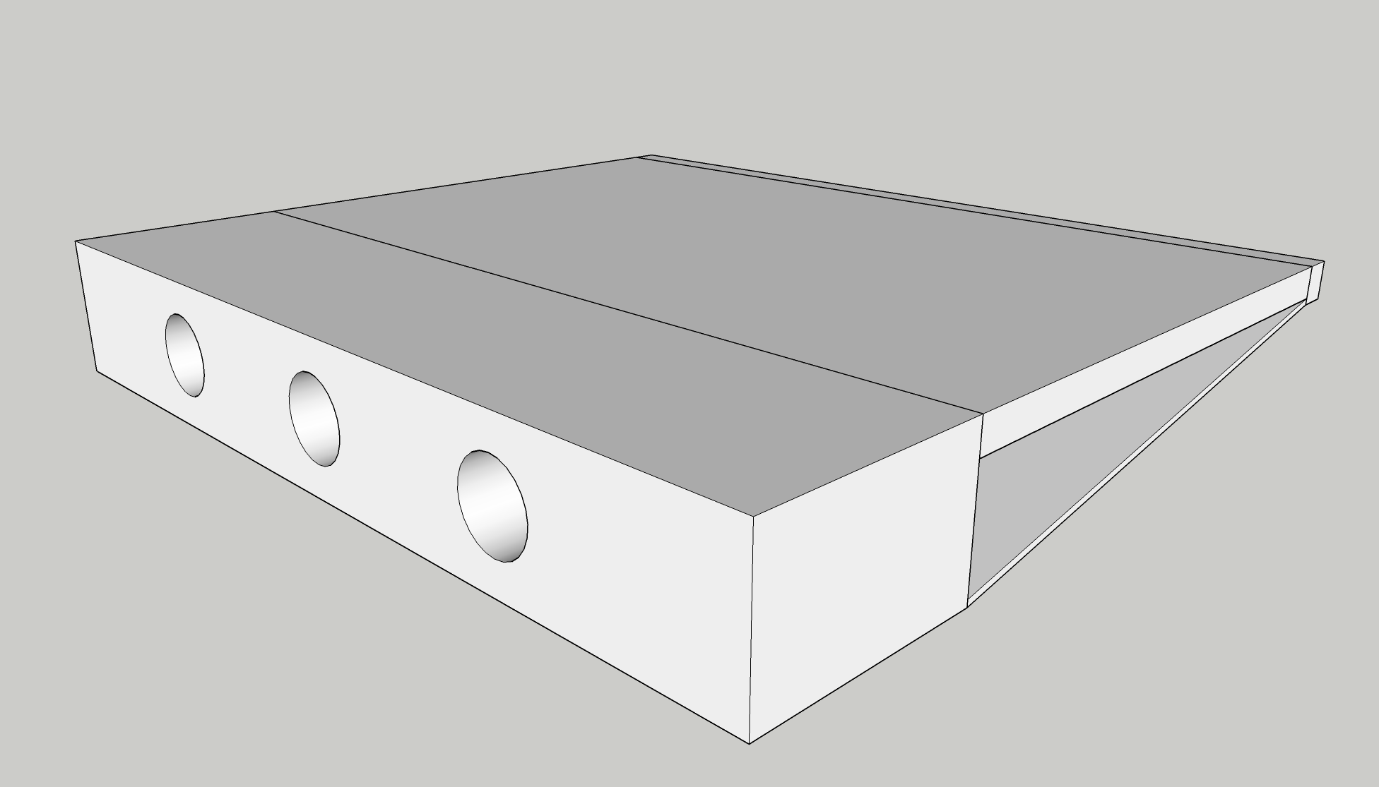
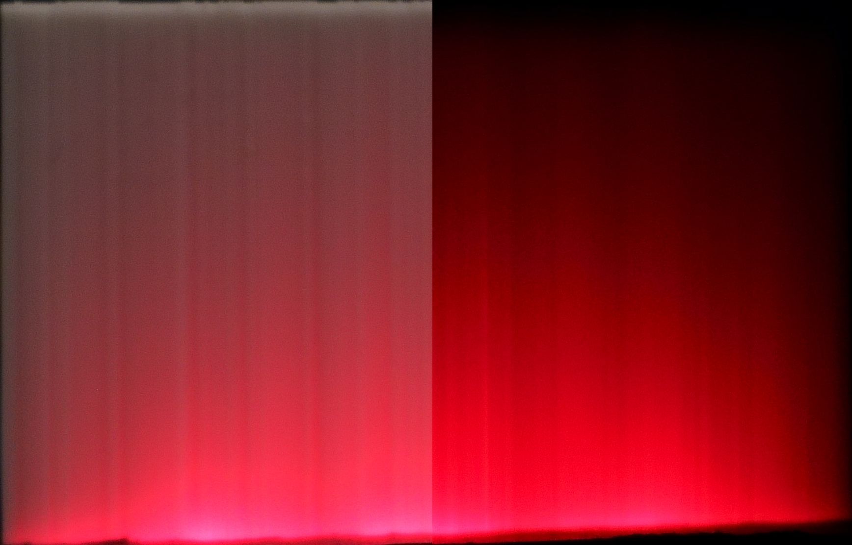
Inspired by the Sony Watchmans CRT design, this design aims to both reflect and diffuse the source of light coming from the side.
 |
 |
|---|
Rating: Too much of a radial gradient, with light pooling at the edge. But the reach of the light is good, making it the opposite edge.
Sidelight
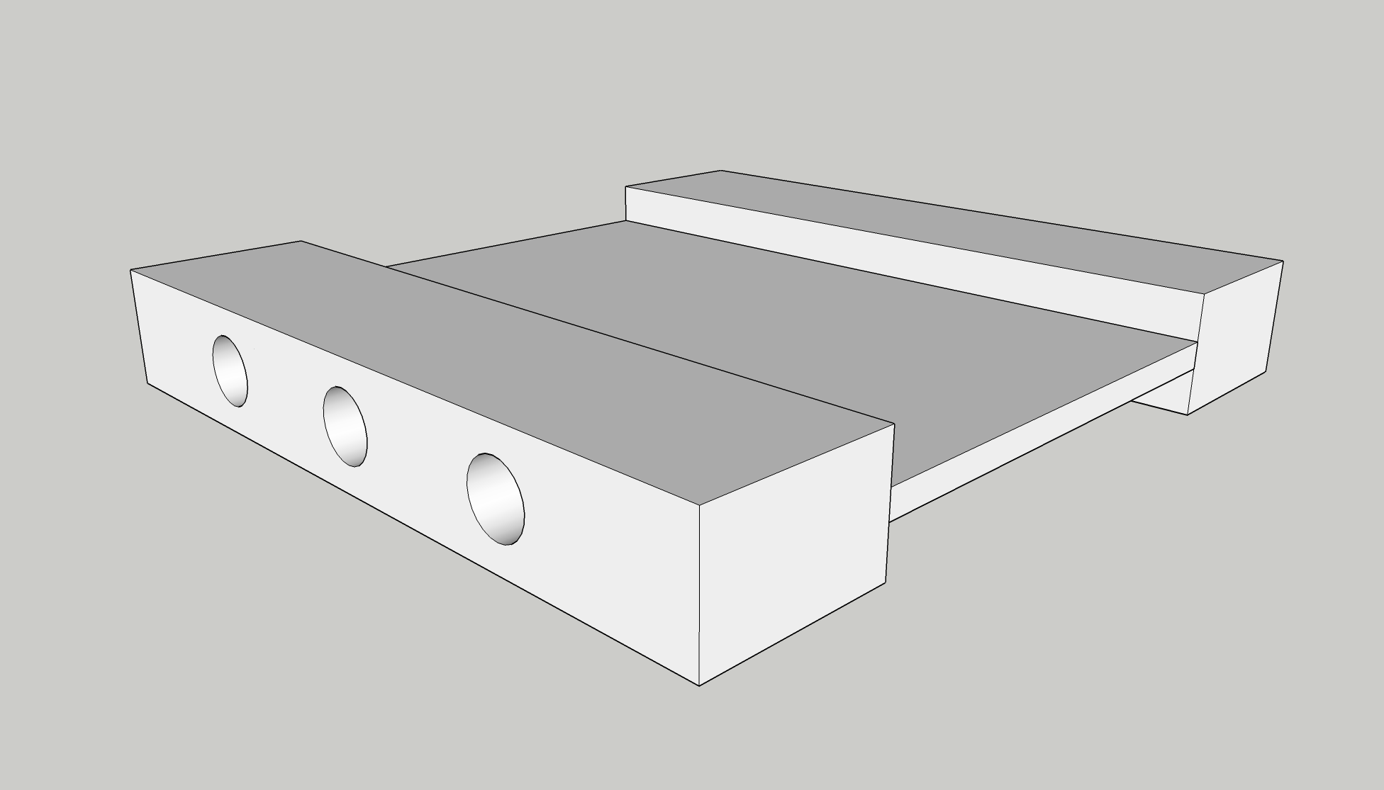
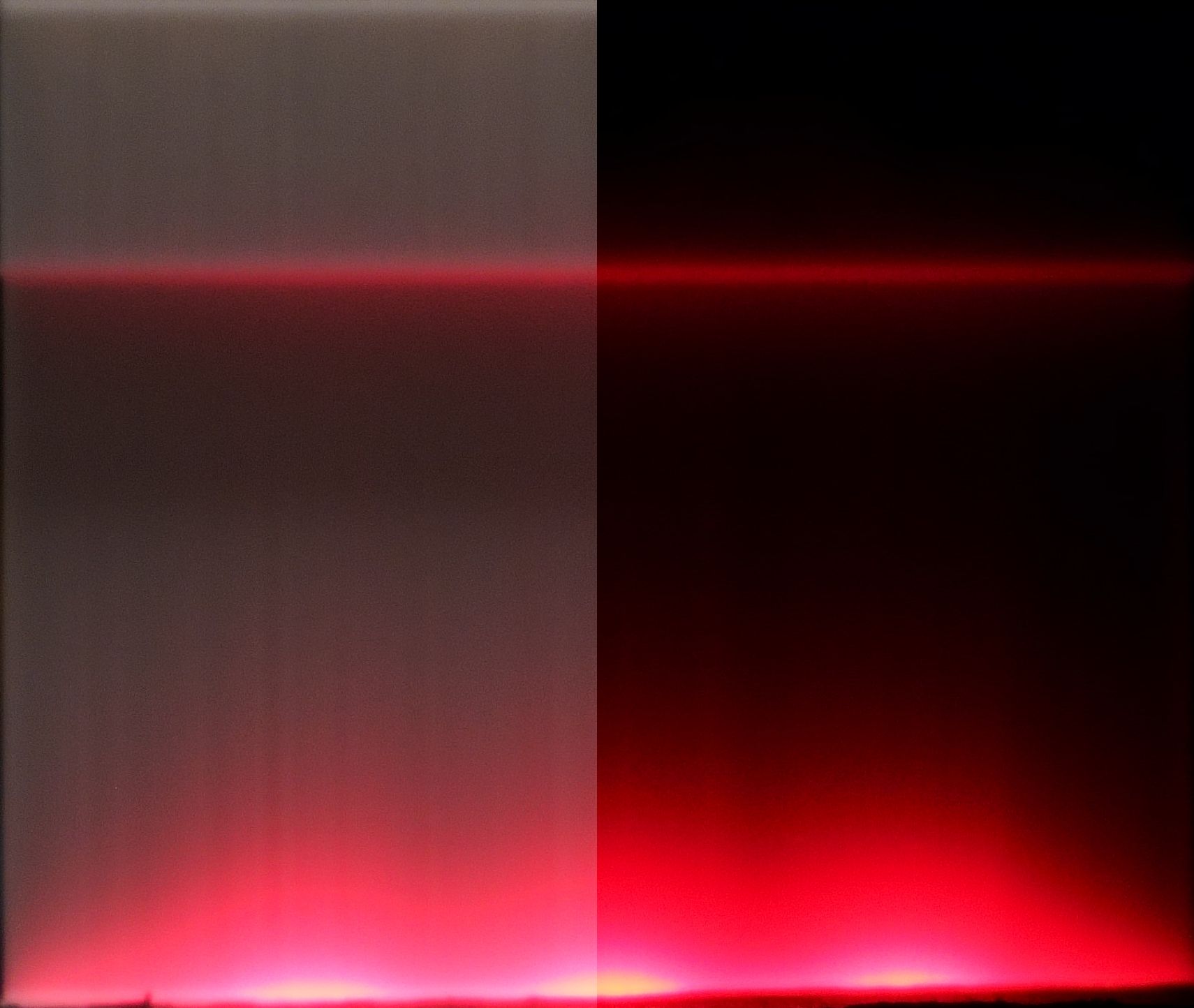
A simple arrangement, with the source of light directly firing at the edge of the screen.
 |
 |
|---|
Rating: Falloff too heavy, light sources are very visible.
Double sidelight
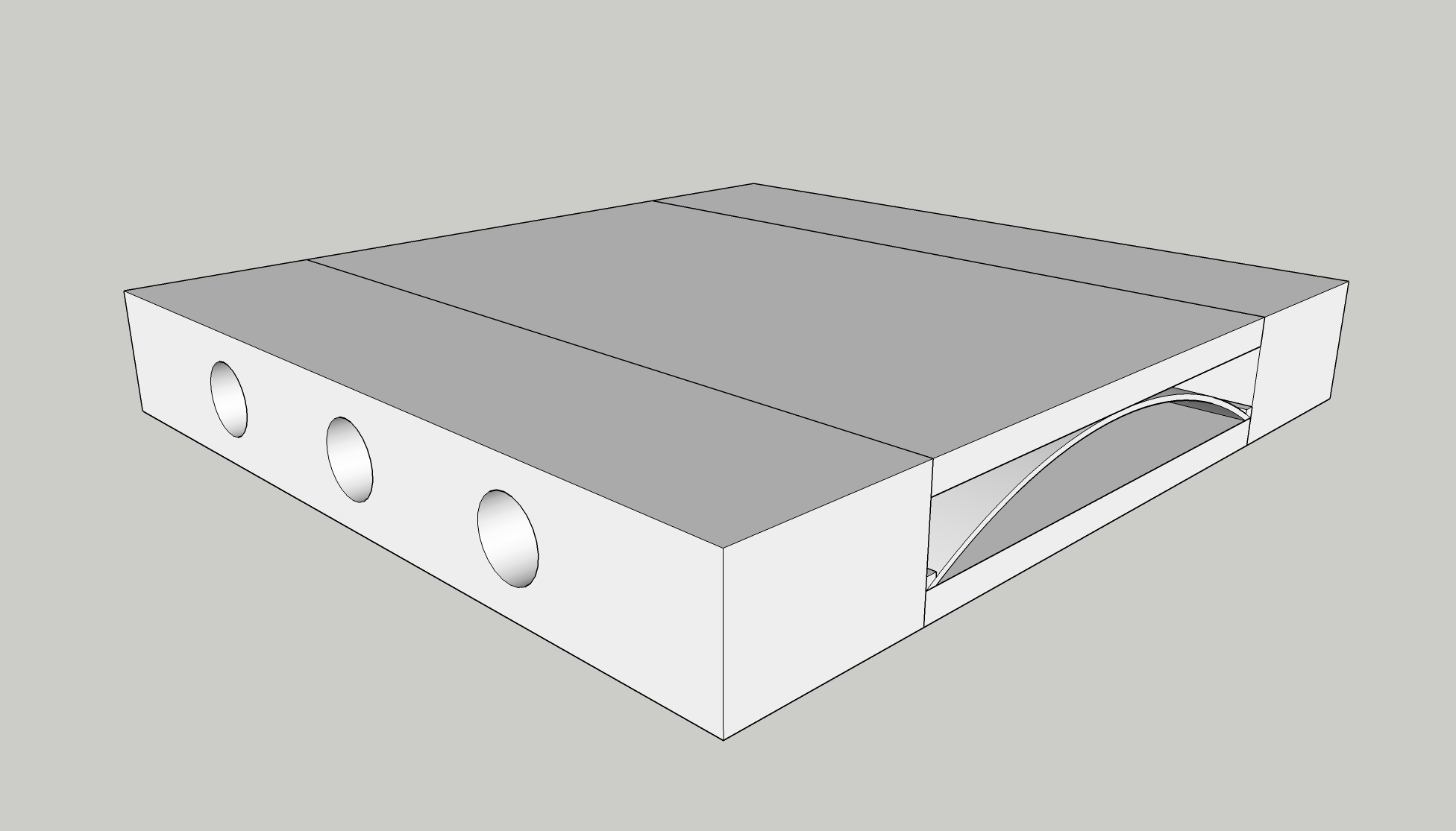
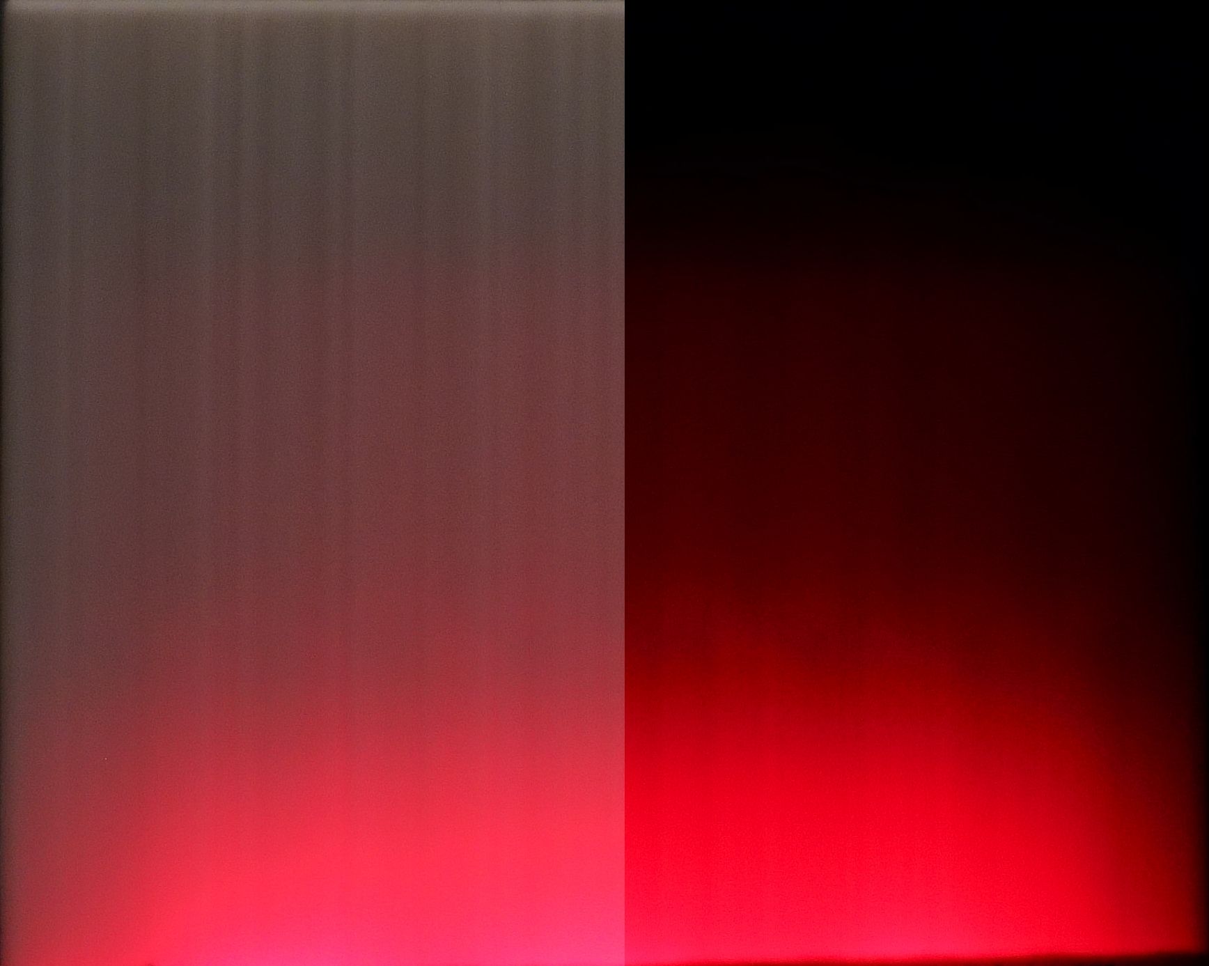
With an inner and outer diffuser, this design is meant to achieve diffusion through refraction.
 |
 |
|---|
Rating: Nice spread and milder falloff, but too much of a radial gradient.
Offset sidelight
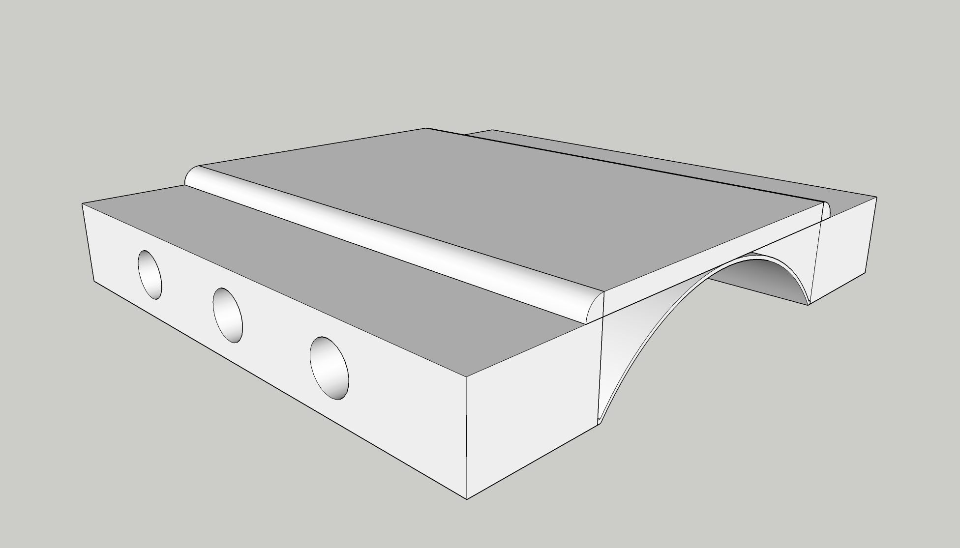
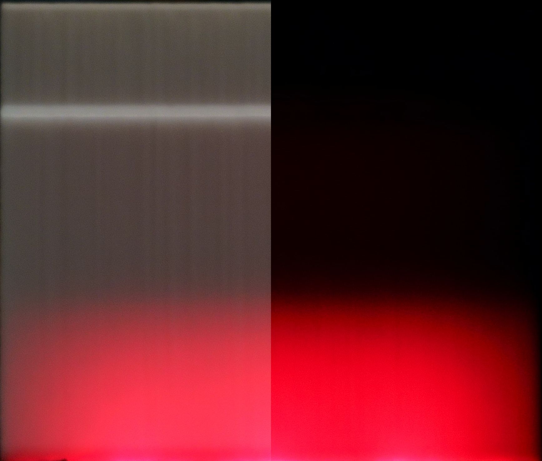
Maximizing the size of the inner diffuser, this design is an "amplified" version of the double sidelight version.
 |
 |
|---|
Rating: Best diffuser so far with a minimal radial gradient and even light distribution. But where the intensity drops off abruptly in the middle where the arch touches the faceplate.
Conclusion
- Using solid plastic as the diffuser is not feasible and induces the inverse square law too much.
- Diffusion through refraction works well and reduces the usage of plastic.
- Any solids through which light travels should not be thick enough that infill is necessary because the patterns are very visible (this is past knowledge and I have avoided this in the designs presented above).


